

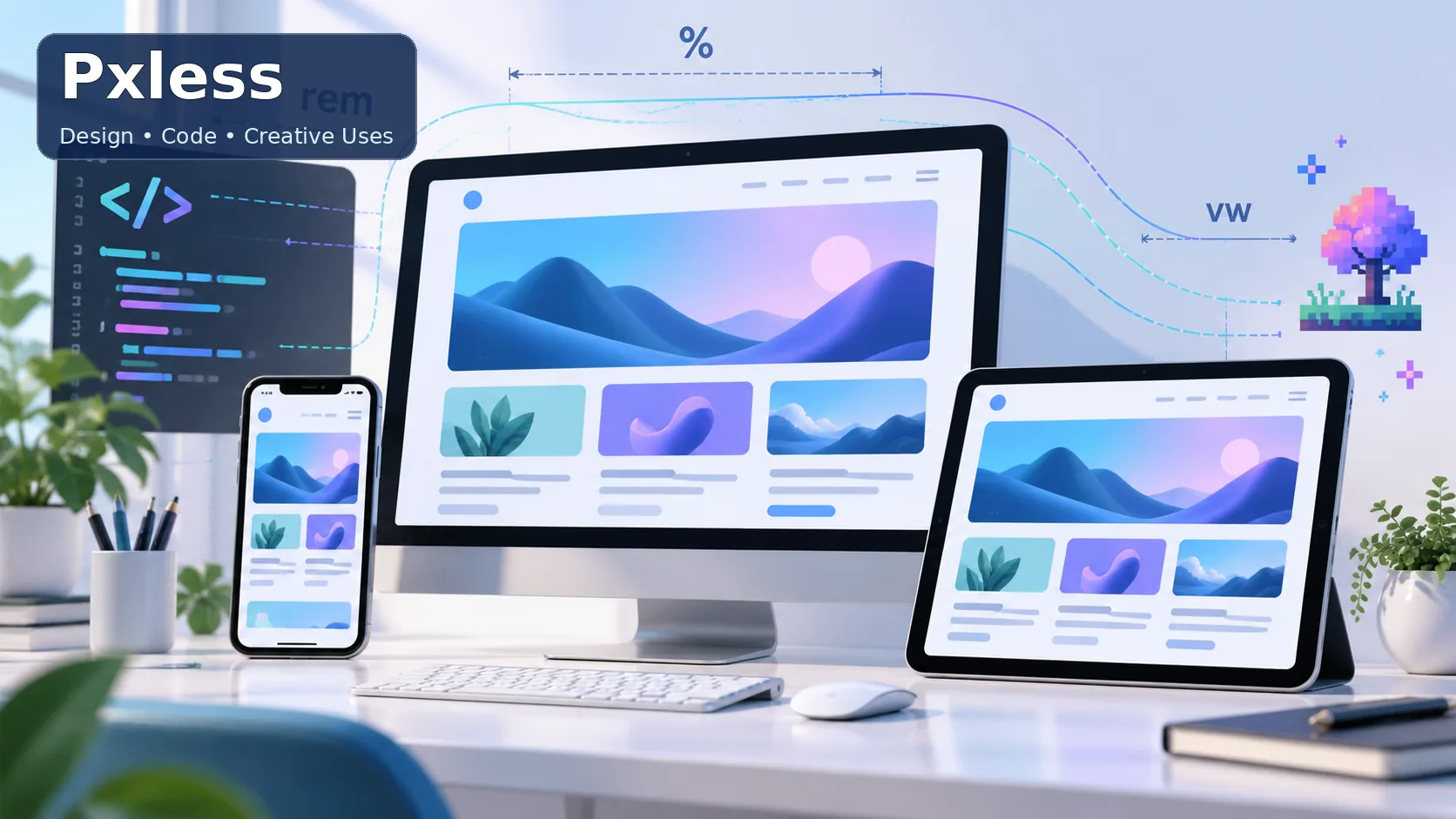
The word Pxless can refer to more than one thing. In design discussions, “pxless” is an informal term for building layouts with less dependence on fixed pixel measurements. In NVIDIA PhysX code, PxLess is the name of a comparison type. Online, similar spellings may also appear as creator names, tags, or descriptions of visual styles.
These meanings are related only by their spelling. Pxless is not an official CSS standard, a design program, or a single online platform. Understanding the context helps you tell whether someone is discussing flexible web layouts, a C++ programming tool, or creative content.
This beginner’s guide explains each use, shows where the term can be confusing, and offers practical ways to think about flexible design. It also covers the limits of the “pixel-free” idea: responsive pages still need careful choices, testing, and occasional fixed measurements.
What Does Pxless Mean?
In web design, “pxless” usually describes a preference for flexible measurements over using pixels for every size and distance. The name suggests “less px,” where px is the CSS abbreviation for pixels. It does not mean that a website contains no pixel values at all.
CSS supports many kinds of measurements. Percentages, em, rem, and viewport units such as vw and vh can define sizes relative to a parent element, text size, or browser window. These units can help content adapt as the available space changes.
The term is informal, so its meaning depends on where you encounter it. A web designer might use it to describe a responsive approach, while a developer reading PhysX documentation may be referring to NVIDIA’s PxLess type.
Pxless as a Web Design Approach
A pxless approach starts with the idea that a page should respond to its context. A heading should remain readable on a phone, a content column should fit a laptop screen, and a button should not become difficult to tap when the layout changes.
This approach can use flexible grids, images that scale within their containers, and text sizes that respond to user settings. CSS tools such as Flexbox, Grid, media queries, and clamp() can help create layouts that adjust without manually designing a separate page for every screen size.
The aim is not to avoid precision. It is to use measurements that match the job. A flexible content area may work well with percentages or a maximum width, while a thin border or a small icon detail may be more predictable in pixels.
Why Flexible Measurements Matter
People view websites on phones, tablets, laptops, large monitors, and other devices. A layout built around one fixed screen width may force users to scroll sideways or zoom in. Flexible sizing gives content more room to adapt to those differences.
User preferences matter, too. Some people increase text size or zoom the page for easier reading. A design that relies on rigid dimensions can break when text grows. Relative sizing can make it easier for spacing and components to grow along with the text.
Flexible units are useful in print-related design workflows as well, but web CSS and print production are not identical. Printers and design software use their own page dimensions, resolution settings, and physical units. A responsive website does not automatically become a print-ready file.
Common CSS Units Used in Pxless Design
Each CSS unit relates to a different reference point. Choosing the unit based on that relationship is more reliable than replacing every px with the same alternative.
%often sizes an element relative to its containing block.emrelates to the font size of the element or its parent, depending on the property.remrelates to the root element’s font size.vwandvhrelate to the viewport’s width and height.
These units are not interchangeable. A percentage width, for example, depends on its containing block, while rem is tied to the root font size. Viewport units can be useful for fluid sizing, but text sized only with vw may become too small on a narrow screen or too large on a wide one.
CSS also includes newer viewport units and container query units. A beginner does not need to use every option. Start with a small set of familiar units, then test how the page behaves at different widths and text settings.
How to Choose the Right Unit
Use rem when you want spacing or text sizes to respond to the root font size. It is often convenient for a consistent type scale, padding, and margins. Because the value follows the root size, users’ browser settings can influence the page more naturally.
Use percentages when an element should take up a share of its available space. For example, a content panel might occupy a portion of a parent container. Set a reasonable maximum width as well, so paragraphs do not stretch across an entire large display.
Use viewport units when the browser window is the intended reference. They can help with fluid hero sections or responsive headings, but should be combined with limits where necessary. The CSS clamp() function can set a minimum, preferred, and maximum size so an element grows smoothly without becoming extreme.
A Simple Responsive CSS Example
A page can combine flexible and fixed measurements. In this example, the content area has a flexible width and a maximum limit. The heading scales within a range, and the page retains a small fixed border.
.page {
  width: min(92%, 70rem);
  margin-inline: auto;
}

h1 {
  font-size: clamp(2rem, 4vw, 3.5rem);
}

.card {
  padding: 1.25rem;
  border: 1px solid #ccc;
}
The min() function lets the page use 92% of its available space until it reaches the maximum width. clamp() keeps the heading between a lower and upper size while allowing it to grow in between.
The card uses rem for padding and px for a thin border. That is a normal mixed-unit approach. Good responsive design depends on how the page behaves, not on whether every measurement uses the same unit.
What Pxless Does Not Mean
Pxless does not mean “pixel-free.” CSS pixels are still part of the web platform, and developers may use them when a fixed value is appropriate. Even when a CSS measurement uses pixels, its rendered size can vary across devices because CSS pixels are not always the same as physical screen pixels.
It also does not mean that relative units automatically make a page responsive. A layout can use vw everywhere and still become hard to read or use. Images can overflow, text can collide, and buttons can become too small if the design is not tested.
Nor is pxless a formal CSS specification or a guaranteed accessibility method. It is best understood as an informal design idea: reduce unnecessary dependence on rigid values and build for changing conditions.
Benefits and Trade-Offs
Flexible sizing can reduce the number of one-off adjustments needed for different screen widths. It can make a design more resilient to text changes, translations, and varied display sizes. This is particularly helpful for sites where readers may use browser zoom or larger default fonts.
There are trade-offs. Relative units can create unexpected results if the reference point is unclear, and nested em values may compound. Viewport measurements can behave differently as browser controls appear or disappear, especially on mobile. Developers should choose units deliberately and inspect the result.
Some details need stable dimensions. A one-pixel border, a small icon stroke, or a precisely aligned control may be easier to manage with px. A strong layout uses a mix of measurements and tests the finished page under realistic conditions.
Accessibility and Responsive Testing
Accessibility begins with content that remains usable when readers change text size, zoom the page, or navigate with a keyboard. Flexible measurements can support these needs, but they cannot replace clear contrast, logical structure, descriptive labels, and visible focus states.
Test pages at narrow and wide viewport sizes. Increase the text size, zoom in, and check whether headings, menus, forms, and buttons still work. Make sure important content does not disappear or require horizontal scrolling for ordinary reading.
Testing should include real devices or browser tools that simulate different sizes. Check long words, translated text, and error messages, since these often expose layout problems. A responsive design is successful when people can use it comfortably, not simply when it fits a screenshot.
Pxless in Large-Format and Print Design
The design idea of using adaptable measurements can help teams think carefully about scale, but web CSS units should not be confused with print production units. A poster, banner, or large-format sign is prepared with physical dimensions, image resolution, bleed, and color requirements that depend on the print provider.
A design may be created in a scalable vector format or built with layout software that supports the intended output size. Raster images need adequate resolution for their final viewing distance and print dimensions. Enlarging a small image does not create additional detail.
Before sending a file to print, confirm the required file type, dimensions, color profile, bleed, and resolution with the printer. These requirements vary by product and vendor. “Pxless” alone does not specify any of them.
PxLess in NVIDIA PhysX Code
In NVIDIA PhysX documentation, PxLess is a C++ template type used for comparing values. It belongs to the PhysX programming framework and is separate from the informal web design use of “pxless.”
A template comparison type can be supplied to code that needs to decide which of two values should come first, such as when ordering items. The exact way it is used depends on the relevant PhysX version and the surrounding code.
The capitalization is a useful clue: PxLess with capital letters is a code identifier, while “pxless” in design writing is usually a descriptive term. Developers should consult the API documentation for the PhysX version they are using rather than infer behavior from the name alone.
Pxless in Creative and Gaming Content
On video and gaming platforms, “Pxless” or “Pixless” may appear as a creator handle, a tag, or a label for a visual style. Users sometimes use similar names for retro effects, pixel-inspired edits, low-resolution imagery, or gaming videos.
These uses are not one unified technology or official design category. A specific account or post can use the word in its own way. The spelling alone does not confirm that the content relates to CSS, PhysX, a camera model, or a particular editing tool.
When researching a creator or trend, look at the original account, description, and examples. This avoids mixing up an individual’s brand or community tag with a broader technical concept.
How to Tell Which Pxless Meaning Applies
Start by looking at the surrounding words. Mentions of CSS, rem, responsive layouts, or fluid grids usually point to the design concept. References to NVIDIA, C++, templates, or PhysX indicate the programming term.
If you see the word in a video title, username, or gaming post, it may be a creator name or content label. The most reliable way to identify it is to examine the source itself and how the author defines the term.
When writing about Pxless, make the intended meaning clear early. If an article covers multiple meanings, explain that they are distinct and use separate sections. This helps readers find the information they need without assuming the meanings are connected.
Final Thoughts
Pxless is a context-dependent term. In design, it commonly describes reducing reliance on fixed pixel measurements and using flexible CSS units where they make sense. In NVIDIA PhysX, PxLess is a specific code type. In creative communities, similar spellings can refer to names, tags, or visual content.
For web designers, the practical lesson is to choose measurements according to their purpose. Combine flexible widths and text sizes with sensible limits, keep fixed values for details that need them, and test the result on different screens and with larger text.
For programmers and creators, context matters just as much. Check the relevant API documentation or original account instead of assuming that every use of Pxless refers to responsive design.
Frequently Asked Questions (FAQs)
Is Pxless an official CSS feature?
No. “Pxless” is an informal term for a design approach that reduces reliance on fixed pixel values. CSS itself provides units and layout tools that developers can combine to create flexible pages.
Does pxless mean a website cannot use pixels?
No. A pxless approach may still use pixels for details such as borders or icon dimensions. The idea is to avoid using fixed values where a flexible measurement would better fit the content or screen.
What CSS units are useful for responsive layouts?
Percentages, rem, em, and viewport units can all be useful, depending on what the size should relate to. Combine them with layout tools and limits, then test the page at different sizes.
What is PxLess in NVIDIA PhysX?
PxLess is a C++ comparison type documented in NVIDIA PhysX. It is unrelated to the informal design use of “pxless,” despite the similar name.
Is pxless design always better than pixel-based design?
No single unit or approach is best for every property. Flexible sizing helps layouts adapt, while fixed pixel values can provide predictable results for small details. The right choice depends on the design and how it behaves in testing.
Does pxless make a page accessible automatically?
No. Flexible measurements can help a page respond to text scaling, but accessibility also depends on readable contrast, usable controls, meaningful structure, keyboard support, and other design choices.




[…] the balance of bass, vocals, and treble instead of accepting one fixed sound profile. Compatible Android phones can also use LDAC, a Bluetooth audio codec unavailable on […]
Comments are closed.